UX puts the customer and user needs at the center of the design process. It's all about an enjoyable, meaningful experience for the user while they interact with a product. Through my education and experience I am trained in multidisciplinary fields, combining elements of design thinking, human psychology and problem-solving.
I conduct research for all stages of the development process. I have experience with different UX research methods (qualitative & quantitative) such as: Focus Groups, Survey Design, Journey Mapping, Wireframing, Affinity Diagrams, Personas, Ethnographic Research, Usability + A/B Testing, User Stories and Content Analysis.
"When technology delivers basic needs, user experience dominates" - Donald Norman
Case Study 1: A Usability Case Study
Project
Review the experience of users using an internal news app that collects the latest news from online media and synthesizes them in 60 words.
Challenge
As a user, once I open the app, I want to have an informative, smooth and enjoyable news reading experience.

Process
1
Empathize
-
Observation
-
Interview
2
Define
-
User Needs
-
Insights
3
Ideate
-
Idea generation
-
Pain Points
Prototype
4
-
Low/Hi-Fi Mocks
-
Sketches
5
Test
-
Solutions
-
Iterations
Persona - Bio

Anna
Policy Analyst, 29
Anna works as an Analyst, as part of the Strategic Communication team. Every morning when she wakes up, she dedicates a few minutes to herself before her busy day starts ahead. She enjoys having a cup of coffee while in the mean time she opens the news app to check the latest headlines. Because of her profession, she wants to be informed and she regularly checks the trending stories, and the sections on politics and economy. If she sees a new article that her colleague Mia would appreciate, she shares it with her. After reading the news for about ten minutes, she then proceeds to get ready for work. During lunch at work she talks to Mia about the news stories and they share their opinions/thoughts with each-other.
It is important to be informed of what's happening around us

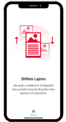
Swipe
With the swipe up/down option, you can switch between different
news and articles
Goal
Recommendations to solve current user's pain points and improve their news reading experience
User Needs
-
Stay informed with the latest news;
-
Quickly find the latest news in the category that she enjoys;
-
Doesn't want to spend a lot of time scrolling the web;
-
Reliable news sources;
-
Ability to share news/articles with her network
App Audit
User Flow

App Analysis
Pain Points
-
App opens up with a message if the users allow notifications or not.
-
It shows users how to navigate the app.
-
It opens up the news section. (link to the original news, bookmark, time when the news was published)
-
To go the main menu, slide all the way to the right
Understanding the different functionalities and the app's overall architecture and navigation.
-
Homepage
-
News page (news are not divided into categories)
-
Sliding to the left opens up the whole article
-
Bookmark section doesn't categorize the news (opens all of them)
-
Same with the tab "My News"
-
Struggle with options such as save or share a story
-
Notifications
Sketches

Prototype


-
Categorize topics and add a navigation bar for them
-
Show/list all the news for each category (photo+title)
-
When a user clicks an article, give them options to save, share it
Proposed Recommendations
-
Every time the user opens the app, go to the Homepage not the News page.
-
For each category list all the news (photo+title), so the user can quickly scroll through.
-
Don't choose the source for the user when sliding to the left, let them choose.
-
Easy-access buttons for users to save, share an article (list all bookmarked articles).
-
Give the option for the user to be notified, send alerts (also mute option).
Case Study 2: Move-in process for new residents

Goal
Submit recommendations to improve the move-in process for new residents.
Methods used
Ethnographic Research, Focus Groups, Content Analysis, Interviews, Survey Design,
User Persona, Journey Mapping,
Affinity Diagrams, Wireframing
Project
Review and improve the move-in process for new residents of a real estate company, Bozzuto Group. Based on the research on different properties in the Washington, D.C. area, our team's task was to provide recommendations for improving the move-in process, which we found to be one of the most frustrating experiences for a new resident. This is an important pain point that could be improved, and especially for a property management company, making this process easier would lead to a better experience for their new residents, and improve the overall performance of the company in terms of the services they offer.
Process
Our research started with 9 site visits (3 drop-in visits, 6 scheduled) to different Bozzuto properties, phone interviews with the brand strategy team and staff. Then, we interviewed current residents (19) and designed a survey to better understand their experience. We also looked at the social media presence and did a content analysis of the website. After the discovery phase of the project, we then worked on creating a user persona, a journey map and a wireframe of the site with our recommendations.
Findings
Our findings conclude that the move-in process can be improved through the implementation of the following tasks:
1. Adding a move-in tab with general information on the website's properties,
2. Training on communications between departments (Concierge/Marketing & Sales), and
3. Ensuring corporate recommendations are filtered down to the staff at properties.


Journey Map
User Persona

Affinity Diagrams
.jpg)

Wireframe of the website
.png)